The Inspiration For The Cosmic Switchboard Logo
I would like to present this idea for a logo for the Cosmic Switchboard site and its achievements, as the work that is being produced here deserves something very definitive, also hoping to suggest the ideals that the efforts of James Bartley and his crew have gifted to its viewers…the chance to come one and come all to reach out for answers, express their thoughts and feelings, describe their own unusual experiences, and provide explanations of what they understand…and joining in this wonderful center to share all things strange and unexplained. It was my hope to create a logo that would embody everything that their work communicates, but also capturing the essence of the mysterious and profound…which is what their labor embraces…I hope that my conception is pleasing to all.
In Support and Praise of The Cosmic Switchboard
I was introduced to the Cosmic Switchboard by one of its moderators…and soon I became tuned to the work of James Bartley and those that support him and also contribute their efforts to this site and the other things that he is doing to reach audiences and also allow the return of the outreach of others…and at once I became very aware of the immense contribution he is making to the study of anything and everything unusual or unexplained, even the most challenging. One of the most magnificent aspects of his work, and this website that promotes it, is the astounding feeling of being totally welcome…and as I’ve expressed to him before, without fear of judgment or rebuke. You won’t be snubbed, you won’t be chided…and you certainly won’t be driven away. I have praised his work, and the courage and steady stability of all of his efforts…even in the face of unjust persecution at times and by a mindless few…and I myself have felt very welcome to come aboard and also talk about my own surreal and mystical experiences, and “extraordinary” encounters…and the invitation as well as the peace of doing so has been sublime.
I had then asked to offer my artistic talents to the Cosmic Switchboard team, particularly my ability to create simple yet unique designs, however amateur that I am…and at once they allowed me to put together something in the way of a logo for their website, which would launch a defining “symbol” for them. The very first thing I had to do, was to pour all my spiritual seeking “muscles” into the reception of what I would obtain as “otherworldly”…and at once I was granted my impressions. I was guided to the selection of certain specific “motifs” to incorporate into the drawing, and this is what was conceived…I was then able to put it down in sketches, then create the basic black and white outline.
The First Sketches
This project was quite involved, along with the spiritual “delving” that I undertook…but it was my goal to create something perfect for them, something that would express the unity of everything that the Cosmic Switchboard represents. I studied a great deal of symbols and effigies…all kinds of designs and concepts and formations that could possibly be used…and yet the same thing kept “appearing” in my spiritual consciousness…even after all my research, it seemed I couldn’t come up with anything that could rival what was already placed in my perceptions…what was already “there” for me to draw.
There were some distinct limits that I was going to stick to, though…including the basic ideas of the certain images that needed to come forth in the design. I wanted to stray away from anything “scary” or “threatening”, so I didn’t want to use depictions of anything “frightening” or what could emanate an “alarming” feeling of any kind. I wanted the picture to be inviting and welcoming, conveying the very nature of the Cosmic Switchboard site…the openness and freedom that people can appreciate, the allure for all to come aboard, the invitation to freely seek and find answers, and also to express whatever they wished, even the most unusual of stories. I truly believed that the logo needed to be very benevolent and appealing…with no sense of fear or the need to have it. It had to be warm and yet beguiling in its own way…yet not immature…it had to be strong and vibrant…and yet comforting and pleasing. I thought that if the drawing had anything in the way of “dread” in it, it would actually create an aversion to the site…giving the logo a very pleasant atmosphere was a major aspect of creating it, and I wanted to portray this very effectively, both in the outline, and in the colors that I planned to use.
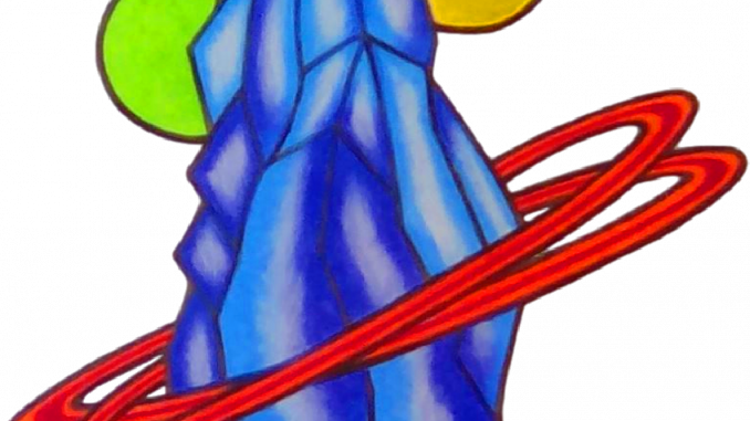
Most logos have to be simple and yet innovative…but they also have to be relevant. The test was to put together something that remained coherent to the site…and yet also expressed everything that I wanted it to. Although I had put a great deal of thought and consideration as well as time into creating it, as I wanted it to be perfect, the spiritual intuition just kept telling me…keep to what I have referred to as the “Stonehenge crystal” design…after a lot of sketches, following my deepest spiritual guidance…I came up with this.
A Mysterious Monolith
I could have used other more “definite” symbols, but I didn’t want the design to invoke something too “limited”, or representing only one particular topic. Even after all my research, though, and seemingly seeking the very right characters for it, I tended to stay with the original scheme…something in the way of a mysterious stone monument…yet something “crystalline”.
I also wanted the logo to display a feeling of mystery, of surrealism…something very mystical…but being very delightful, yet also very profound…however peaceful and pleasant. Since the very start of the plan, I had chosen a rock-type “crystal formation” to be the main item…symbolizing something very beautiful and yet captivating…alluring and enchanting…to invite onlookers to be more “drawn” to what it represents, and wanting to “reach out” for it. It was also supposed to depict the idea that the quest for knowledge and insight is a strong focus of the work of the Cosmic Switchboard…but the “magical crystal” also reveals something very earthly…but also having a very “deep” sensation to it.
I had thought of the pillars of Stonehenge, or a similar ethereal “rock” paradox…still unexplained and holding centuries of puzzling thoughts and conjectures, but a riddle never having been solved…being very earthly, but “unearthly”, and yet also mysteriously beautiful. It had to be a pylon…it’s “tallness” was important…to mimic the famous stone enigma. But I chose a crystalline version, because I have always been attracted to crystals and minerals…but also this idea seemed to be just “perfect”, because it exuded something exquisitely beautiful yet unsolved, and having been stumbled upon on earth…no one can be able to crack its code or figure out its reason, quite like many of the hidden and unrevealed perplexities that are expressed…but I felt that nothing would radiate a more deeply mysterious feeling than a towering “mega crystal”.
Minerals and crystals also have some affinity to wisdom…to being very profound in their own right, and holding their own unique beauty and magic, having a special magnetism to them…the “cosmic crystal” exudes mystery but also entices those who are seeking reality to look upon it…it is also meant to exhibit the search for answers and the truth. I had always loved stones and rocks and minerals since I was very young, having a very mindful fascination for them, and seeing them as having their own sort of “intelligence”…as well as very deep meaning.
The idea behind the “rock crystal” is a feeling of mystery, of the earth, the unexplained…yet something beautiful and appealing, and yet surreal, but also different…hoping to capture the essence of “unsolved enigmas”…but still very “basic”, (and not so specific)…but still rather “of the earth”.
Celestial Themes and Color
To epitomize the Cosmic Switchboard on its own, and everything universal that it represents, I chose three “extraterrestrial” figures…symbols of the cosmos, to imitate the ambience of deep space…Saturn-like rings around the crystal, a planet, and a giant crescent moon. This was meant to connect with the core of the site and the meaning of its title…and give the sky-reaching crystal a more “cosmic” appearance. The cosmic symbols would signify the website and combine the mystery of the crystal with the true essence of what the site produces and speaks for.
The black outline was necessary…without it, the “logo” looks too much like an “art piece”…but there was also some meaning and purpose for the colors that were chosen. The crystal itself had to have “cool” colors, as again the composition had to emit the feeling of graciousness, wonderment and peace…serene to the eyes, yet also being “deep”…yet intoxicating enough to capture the essence of mysteriousness…therefore it was very important to choose the right colors. The crystal is drenched in refreshing hues, but they are also “bright” enough to reflect the impression of being an unexplained anomaly…they were meant to transmit a very “inviting” feeling, as well as the attitude of mystification…yet something “ethereal”.
After a lot of experimenting and “polishing” of the possible color version of the logo, I finally decided on bright blue and deep purple as the best “cool” colors for the crystal…while the planetary rings were to be in vivid accent shades of orange and red. The colors of green and yellow in the planet and the oversized moon are “basic”…but also meant to be upbeat and merry…with some amount of “illumination”.
My Tribute
Creating this logo for the Cosmic Switchboard is my way of honoring their endeavors, as well as thanking them most sincerely for their very warm welcome and their appreciation of my participation in their newest activities. I am also most grateful for the knowledge and insight that they are providing to the world, and their very brave envelope of every expression imaginable, or any eccentric question…I have a great respect for what the admins and moderators of this site are doing and also the courage that they are displaying in their efforts…I hope the new logo is satisfactory, and deemed worthy of their work.
Theresa Tucker


Thank you for our new logo❤️